Page 16 - voices-2023-04
P. 16
FROM THE DESK


      the District 7 YouTube Channel onto your  that it becomes visually overwhelming,
      site, so that visitors always see the latest video.  which can result in a visitor losing focus on

      If your club has an active Facebook, Twitter,  the content.
      InstaGram, or other social media page, you
      can embed that onto your club website to  Did you proof read everything?

      show member engagement.  In general, you                   It could be embarrassing for an
      should avoid having content that sits on your  educational organization designed to help
      website for months, or years, referencing  people build communication skills to have
      some event that is now in the distant past.            a website full of grammatical and spelling
                                                             errors. Times can also be an issue. For

      Does your website have attractive visuals or  example, a common error I have seen is to
      graphics?                                              post a meeting that “Starts at 12:00AM” and
          It is often said that a picture is worth a  ends at 1:00PM. 12:00AM is midnight, so this

      thousand words. On your website, having a  is a 13-hour meeting.
      layout that includes photos of club events or
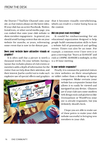
      members adds a depth of information for the  Is your website responsive?
      visitor that can help draw their attention, and            Finally, it is common for potential visitors
      their interest. Just be careful not to make such  to view websites on their smartphone

      explosive use of special effects and graphics  or tablet rather than a desktop or laptop
                                                                        computer. Make certain your
                                                                        website has a responsive format that

                                                                        allows it to easily be viewed and
                                                                        navigated on any device.  Chances
                                                                        are if your club uses some modern
                                                                        web design tools and platforms like
                                                                        freetoasthost or WordPress your

                                                                        site is already responsive, but you
                                                                        definitely should check.


                                                                            I hope you are able to make use
                                                                        of these points to make your club
                                                                        website successful in bringing new
                                                                        members to your club.


       16     ONE COMMUNITY

