Page 33 - 2016-10
P. 33
for connecting to your sponsors.                                            website and click on Resources. Follow the
    Let’s also talk about fonts. In the two                                 prompts to choose the correct sample flyer
                                                                            for your event.
examples, Arial and Open Sans were used. While
the two fonts are similar, the slight difference                                 In the long run, creating flyers doesn’t
gives the flyers a nice, finished look. As a rule of                        have to be an arduous task. Remember the
thumb, two font styles are more than enough.                                five elements— graphics, who, what, where,
                                                                            and a call to action—and unleash your
    Speaking of a finished look, note that the                              creative juices!
margins are a bit deeper than those used in a
typed page, the fonts are larger, and there is                                   If you need help creating your flyer,
more space between the lines of text. Flyers                                send me an email at phyllis.harmon@
should have an abundance of white space so                                  d7toastmasters.org.
that the eye can easily absorb the information
within the reader’s 20-second attention span.                              On the Road Again. . .

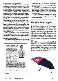
    Let’s talk briefly about the back of the flyer                         If you are in the Portland, Vancouver,
(see example 3). As suggested earlier, use the                             Eugene or Medford area, be on the
back for more detailed information about your                              lookout for transit ads. Buses are
event, keynote, or organization’s mission and                              already on the roads displaying the
vision. I recommend that you stick to the color                            ads on sides and tails. If you spot an
scheme chosen for the front of the flyer. Preserve                         ad, snap a photo, safely of course, and
the margins, fonts, and line spacing used on the                           email it to our Club Growth Director
front of the flyer.                                                        Cathy French at cgd@d7toastmasters.
                                                                           org
    There you have it - great examples of how                              We will have two winners in Medford,
to create your next flyer. I recommend that you                            and one in Portland, Eugene and
go to Google Images and look at different flyers                           Vancouver. Our 5 winners will each
created by others. Choose one that appeals to                              receive a blue Toastmasters umbrella.
you, and try to recreate it.                                               Keep your eyes peeled. Bonus points
                                                                           if you post it on Facebook.
    Also, Toastmasters International has excellent
materials for marketing your event. Go to their

    Robert Becker, CSP

        Voice and Stagecraft Coach

           Lorem ipsum dolor sit amet, esse
           philosophia te vel. Dicit dolore dolo-
           rum nec no. Facer scripserit eu vim,
           ut sea voluptua reprimique medioc-
           ritatem, facete legimus salutandi mel
           at. Sea cu simul quodsi numquam.
           Eos id stet fugit laoreet, ius bonorum
           molestie conclusionemque at, id trac-
           tatos inciderint eos. Ad cum stet ex-
           erci, ex mea diam summo, sea agam
           neglegentur et.

           Agam oblique bonorum usu cu, pro-
           bo fabulas vim ea. In vim platonem
           scriptorem. Vis ex mutat accumsan,
           ad aliquip evertitur posidonium sea.

           Lorem ipsum dolor sit amet, esse philosophia te vel. Dicit do-
           lore dolorum nec no. Facer scripserit eu vim, ut sea voluptua
           reprimique mediocritatem, facete legimus salutandi mel at.
           Sea cu simul quodsi numquam. Eos id stet fugit laoreet, ius
           bonorum molestie conclusionemque at, id tractatos inciderint
           eos. Ad cum stet exerci, ex mea diam summo, sea agam neg-
           legentur et.

           Contact: http://generator.lorem-ipsum.info/

Example 3

Volume 3 Issue 4 - OCTOBER 2016                                            33

